
Project HydraBlaze (fictional name) was launched during my work with a global funds manager. The goal of the project was to develop a set of tools to help professionals understand better their investment ecosystem through data, and incorporate data insights in their decision-making.
My work on this project is subject to confidential agreements, therefore all visuals will be stripped from actual data points.

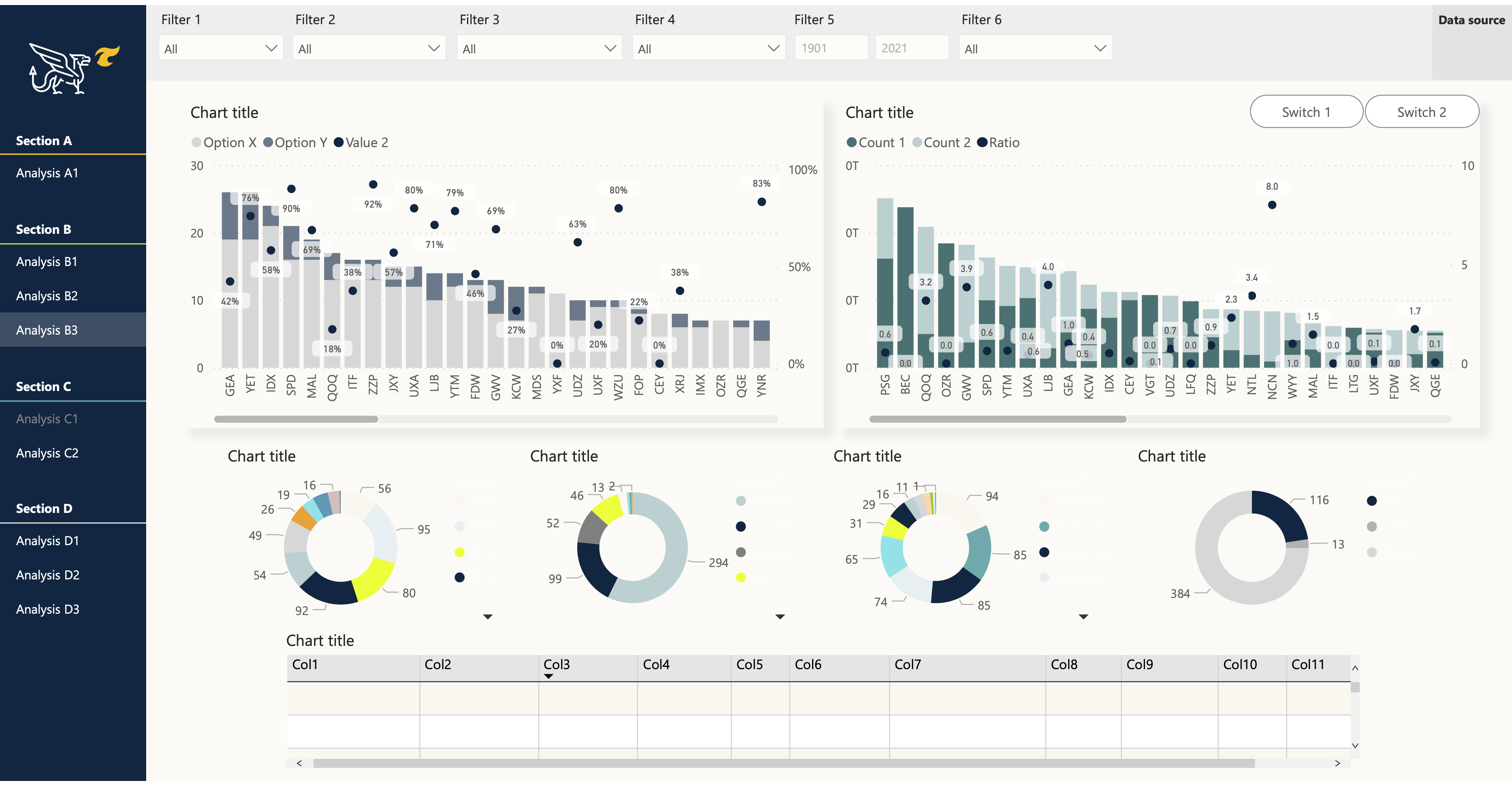
Build interactive dashboards (with Power BI) destined to investment professionals, for them to explore multiple datasets and extract insights based on preferred metrics. I was responsible to build the back-end data architecture as well as the end-user interface.
Successfully delivered the final dashboards to the investment team
The project received funding for scaling in other investment groups
The tool reached the top 10 most visited dashboards in the organization
Centralized five complex data sources for real-time consumption
The final dashboard contained nine pages which offered different ways to analyze the data. The pages were delivered one at a time. For each delivery, I established the following process to ensure that users were always kept in the loop and that the tool would truly answer their needs.
Understand which metrics are used by the business when making investment decisions, and what data is needed
Iterate on multiple versions of low-fidelity mockups to explore how to visualize the metrics; business stakeholders included in the versioning process
Final mockup is translated into a dynamic dashboard, incorporating all necessary datasets
Small set of users solicited to test the dashboard, which leads to iterative improvements. Once completed, additional users are onboarded and the tool is officially launched
One of the main reason behind the successful adoption of this dashboard is its fit to users' knowledge, preferences and needs. Here are some of the main characteristics that I have observed through continuous dialogue with the end-users, which helped me shape the dashboard in the right way.
Direct users
Analysts and associates
(play with data and extract insights)
Indirect users
Investment managers and directors
(learn from extracted insights through presentations)
Cognitive load
Overloaded schedule: will not spend time learning and using a tool if it does not yield value
Data manipulation skills
Proficient Excel users: strong mental model to be reused
Work spread across multiple spreadsheets, which could be centralized
Financial knowledge
Experts: will spot anomalies in calculations easily
Take advantage of known and trusted metrics
Statistics & data visualization skills
Intermediate: new metrics and visuals should be easily interpretable
Preferred format
Love a dynamic interface to brainstorm, but need static export capabilities to demonstrate findings
My work on this project is subject to confidential agreements: all visuals will be stripped from actual data points.


.png)